


Developing ideas about colour
Over the last past twenty years of knitting with the amazing yarns that independent dyers produce, and more recently quilting with some great fabric ranges (particularly Oakshott and Moda Grunge Basics) I have, I think, begun to develop my ability to bring colours together in pleasing ways. However, I don’t think I have ever thought much about why things look good (or not) beyond the ideas I have brought from physics. So it was interesting to learn more about Colour Theory at the start of our current module Colour and Material.
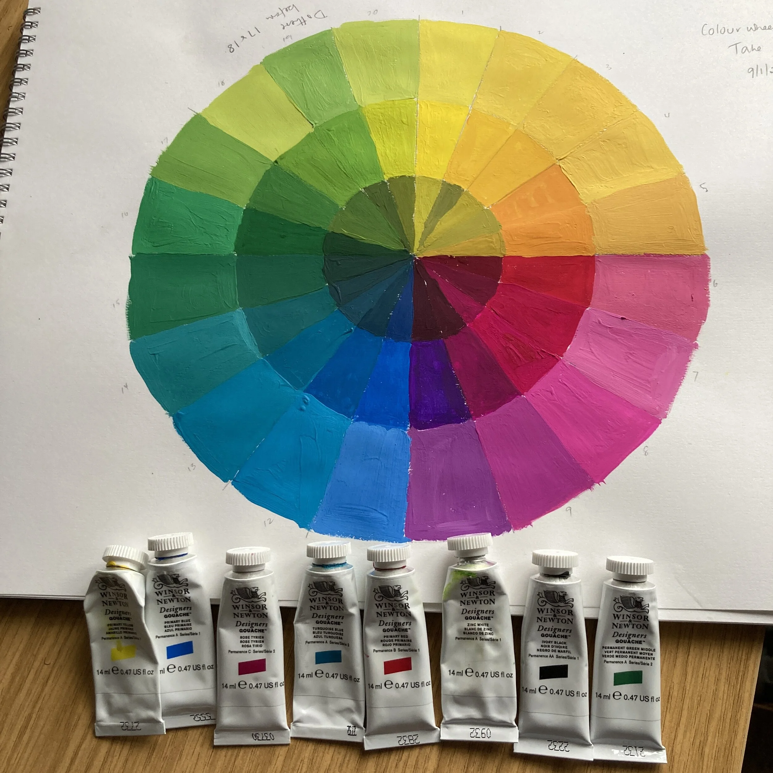
We were painting with gouache paints, which were new to me, and even three months later I haven’t really got to grips with using them. I find it really challenging to mix a particular shade, I add a bit of this, and a bit of that and end up with far too much of the right shade - and sometimes far too much of the wrong shade. So my colour wheel leaves something to be desired.

We were asked to bring a ‘found still life’ to the first class of the semester, which was held online owing to Lockdown 3. Like most of the class, my still life was a domestic scene, the view across our kitchen to the lovely seascape painted by Rosie Dean, a York artist.

For the next two months we were to use this still life to develop a colour palette which we would then use as the basis for weaving. We were given a list of ideas and approaches to the task, one of which was to produce our own version of this ‘big picture’; I got the impression that we were expected to paint this big picture, however I am so inexperienced with paint that I decided that I would make a collage. I used a variety of media as well as paper, there are paint, oil pastels, pencils, and fibre. I am pleased with most of it, though the oil pastel freesias are a disappointment; they were done directly on to the page so I couldn’t have another stab at them, unlike most of the components which had several attempts before they looked right. Vindication that I was right not to attempt the whole thing in paint or pastel.

Although I did continue to mix paints in attempts to create a colour palette from the still life, I also used other approaches. I enjoyed using digital techniques - including pixellating the image to identify the dominant colours, digitally manipulating the image and then using multiple copies of that to produce something new.

I did eventually get back to paint, but nothing figurative, just exploring ways of combining colours and identifying effects. My brushwork is still not good, but I will keep trying. The effect I am most pleased with is using a dry brush with little paint, adding layers in different colours to obtain a variegated effect. The solid colours are less pleasing, and printing with gouache is not very satisfying.

In March we had our second teaching weekend, and after collecting a loom from college, we began to learn to weave. So I have put my paints away and and am back in a more comfortable place, using yarns to mix colours, but that is another post.