


Seascapes
This project is my response to the current government’s treatment of treating asylum seekers and refugees who come to this country, particularly those who travel across the English Channel in small boats. These politicians treat them all men, women, and children, as criminals, despite the fact that the majority of those requesting asylum are granted refugee status, or some other form of protection. There is a better way that removes the need for crossing in small boats: provide the opportunity for people to apply for asylum in the UK whilst they are in mainland Europe.
Images of people crammed into small rigid inflatable boats on rough seas have inspired me to produce this work that attempts to evoke the risks asylum seekers take in making the crossing.
For this installation I am aiming to create a seascape that evokes the danger and jeopardy experienced by those using this route to reach the UK.
So what is the essence of a seascape?
I love being at the coast and walking on the beach, and have lots of photos of the sea, but none taken out on a rough sea (I don’t travel that well).


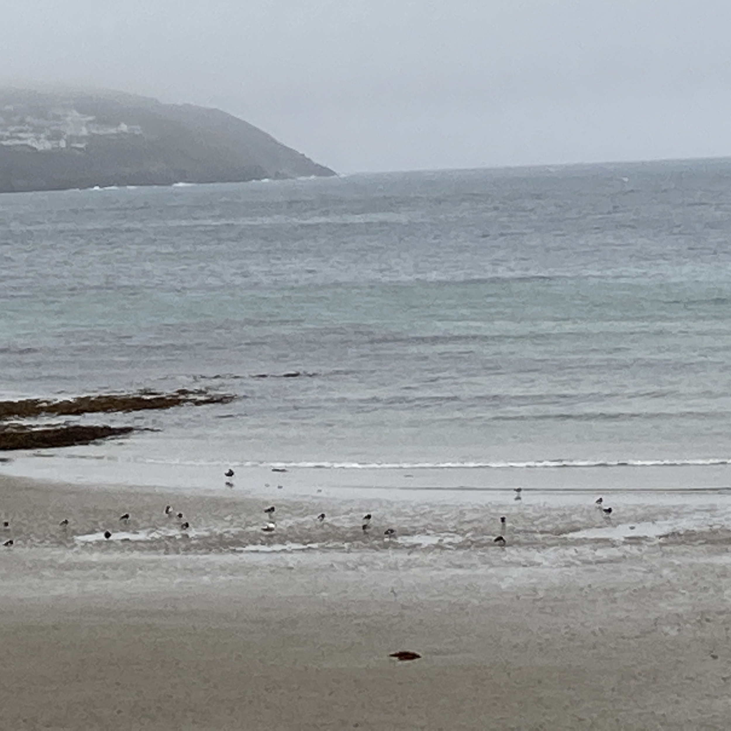

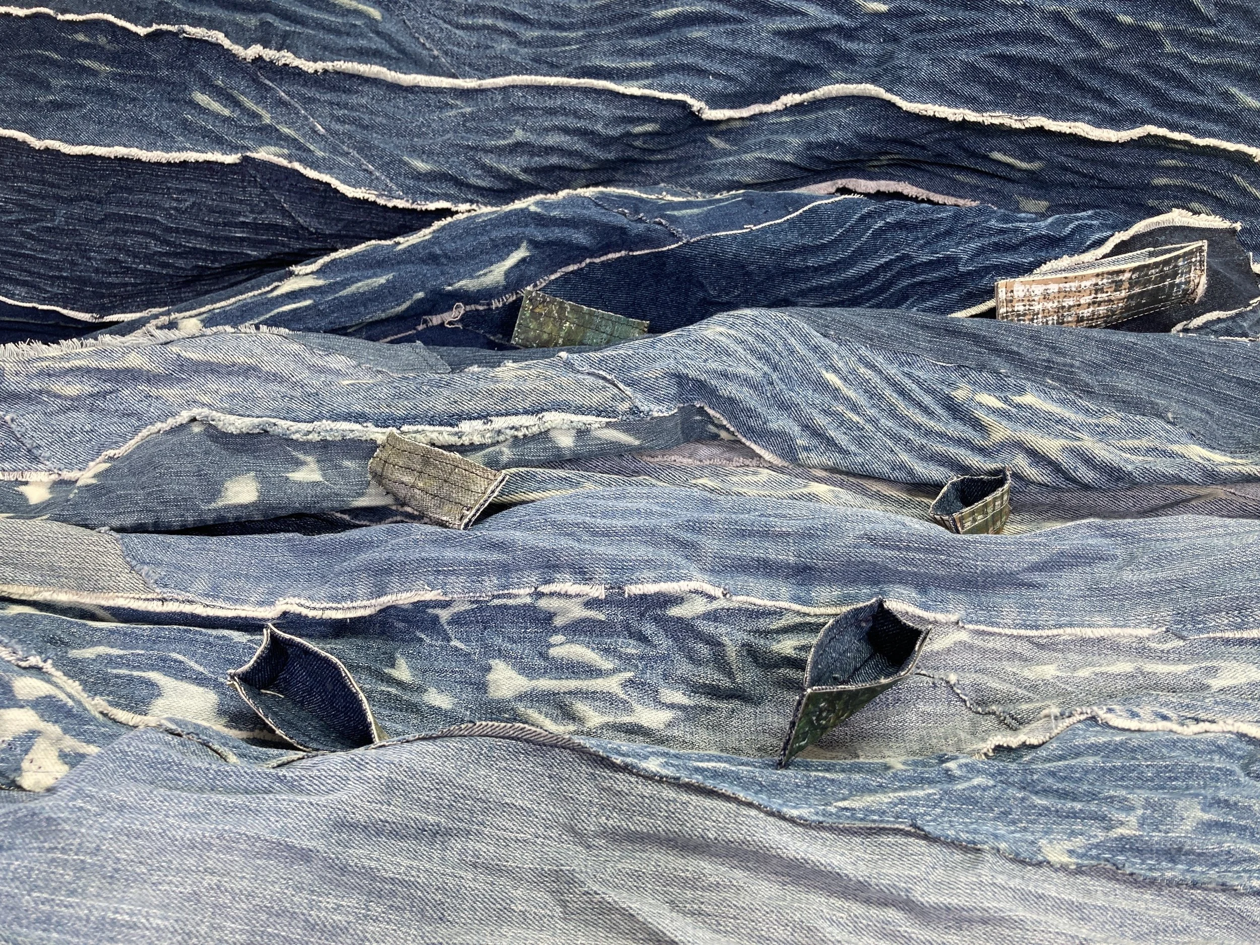
My photos show that there is always variation in colour across the sea, there are usually flecks of white crests of waves, even a long way off, the sea sometimes merges into the sky and there is always a texture showing movement of the water
But what does a rough sea look like? There are, of course, plenty of images online, but when I passed this painting by Paul Nash at the Tate Gallery I thought it captured well the ‘essence’ of a rough sea.

Paul Nash Totes Meer (Dead Sea)
When I first saw it, I thought it was a sea painting and, moving closer, I considered why it looked like the sea, and how I might use it to help my seascape. The huge aircraft wing edges, with the appearance of waves, lit by the moon, give a real feeling of movement. I want to get that feeling of surging waves into my work.

I began by going back to paper and glue, creating a collage, with attention to Nash’s painting.

The key feature that creates a feeling of movement is the constant change of direction of the background strips, and lack of symmetry of some of the wave crests.
I then constructed waves by layering triangles of denim, cutting across the bias to achieve similar effects to those had created when using stitch and slash techniques.
These traingles were distressed by soaking in water, using friction and then bleach to give shredded, whitened edges.
Whilst these waves gave some feeling of movement, they were perhaps out of scale with the horizontal strips that created the main body of work.
Nash painted a landscape oriented image, with that feeling of movement across the piece; I was trying to develop a tall narrow, and the shapes didn’t work in that orientation.
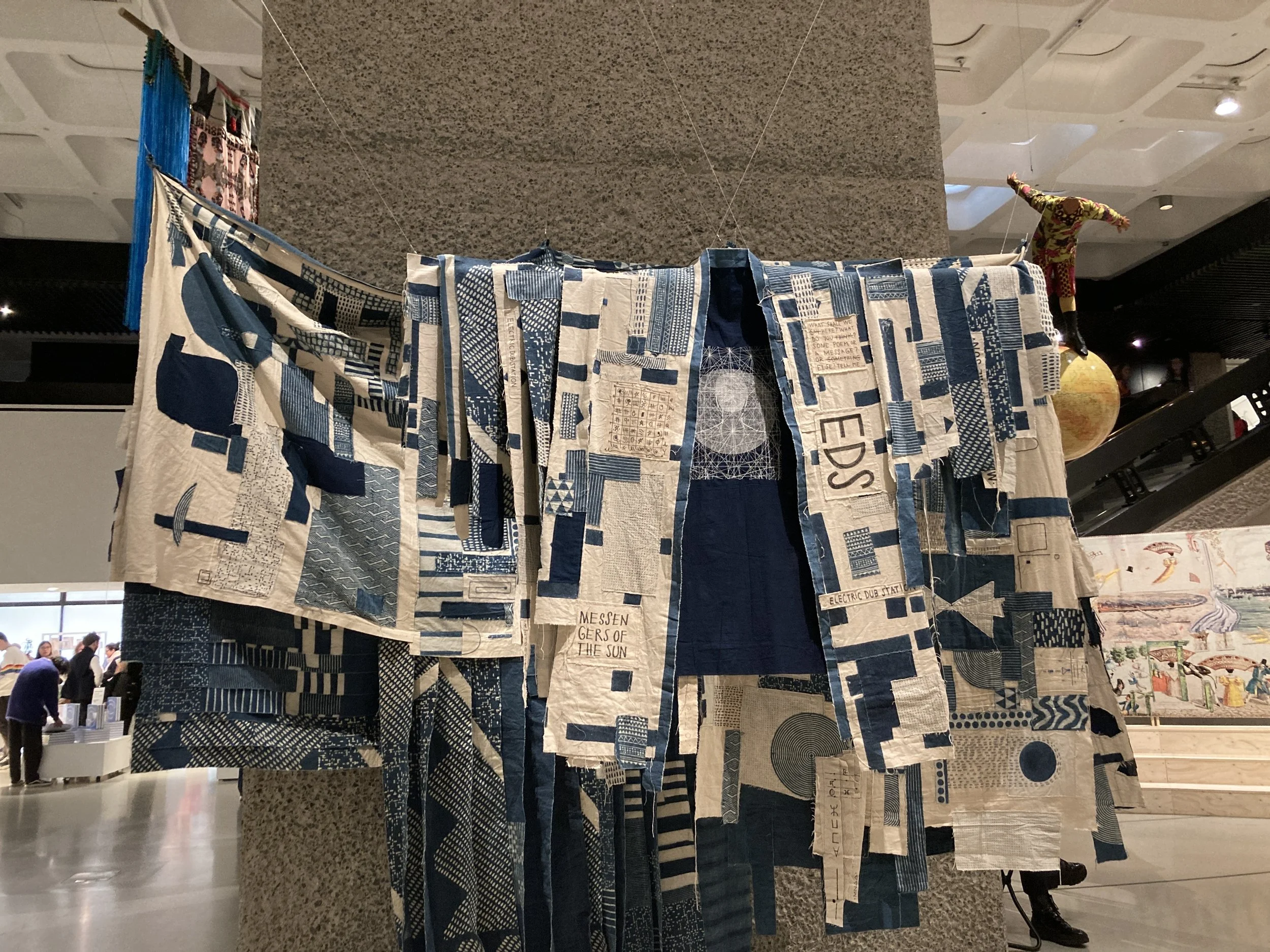
Back to the design wall ………