


Text in textiles

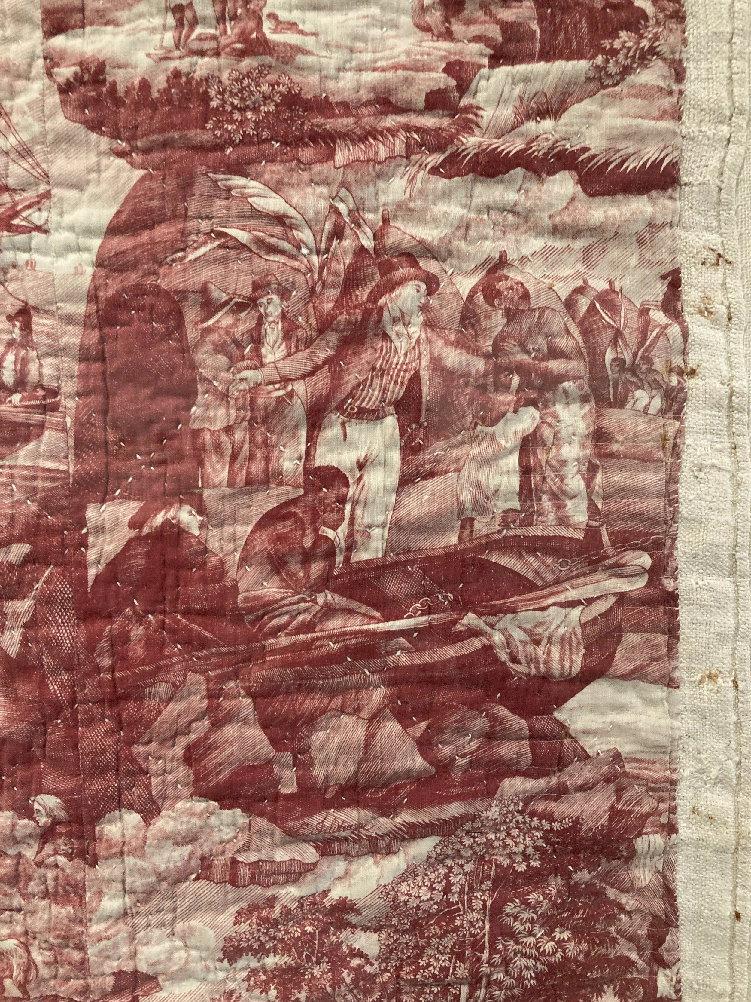
Caren Garfen Cut it out (detail)
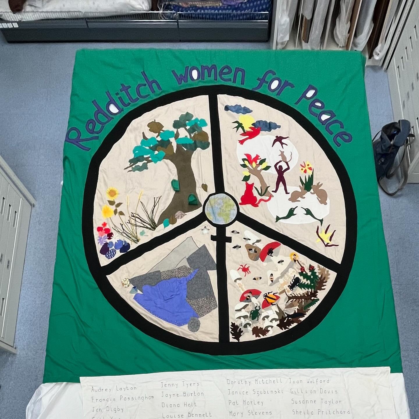
At Tailored , a 62 Group of textile Artists exhibition at Sunny Bank Mills 2023
There are a large number of stitchers who use text in their work, including Caren Garfen whose exquisitely stitched text commemorates those who lost their lives in the Holocaust, and Chawne Kimber who addresses injustices in the US.
I am particularly drawn to these artists’ works as they use the text to address social justice issues.
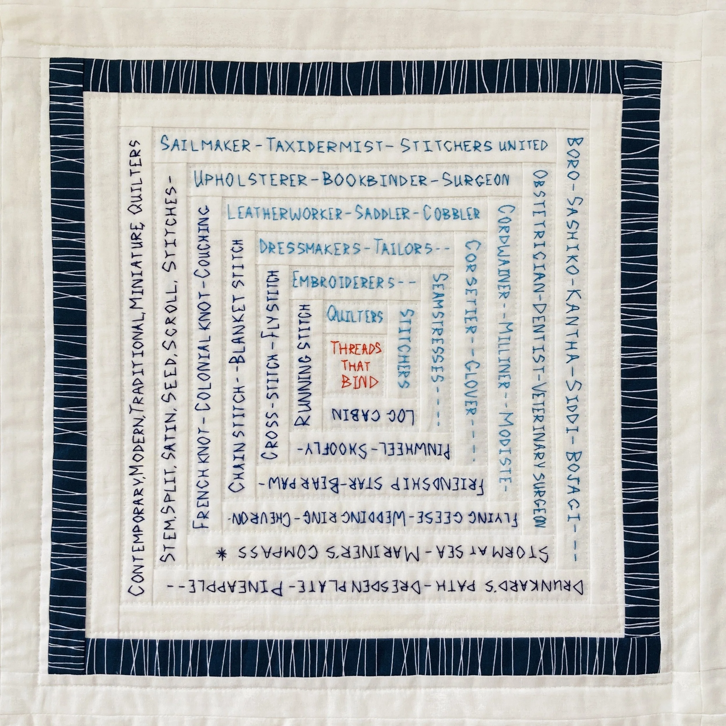
I have been adding text to textiles for some time. In 2020 I created a quilt for the Quilters Guild Challenge at Festival of Quilts. The theme of the challenge was Threads that Bind. For the central block in the quilt, I stitched words that related to the title, including names of stitches and quilt blocks, and professions that use stitches. By the time I finished working on this quilt I had developed a style of stitchwriting that I continue to use.

Mary Whitehouse #imintheguild (detail) (2020)Festival of Quilts 2020

Chawne Kimber One for Eric (2015) (photo: Plaid Portico) https://www.womenarts.org/2017/02/02/the-colorful-radical-quilts-of-chawne-kimber/
In 2022 I ventured into applique lettering for the first time, spending some time finding a font that I liked (this is Britannic). I decided to leave the middle spaces in letters filled, initially for pragmatic reasons, it made cutting out and stitching the letters much easier, but it also made the font distinctive. This was used on the WasteAge Bag that accompanied my WasteAge coat at the Bradford College Fashion Show in 2022.
In 2023 my quilt for Festival of Quilts No one should die used text to convey the message of the quilt (see my previous post Activism and the Arts). I liked the font I had used on the bag and used it again on the quilt. One of the judges gave positive feedback on this aspect of the quilt, “Good use of materials and font used for letter applique”.
I am now thinking about the text to use in my current project. During my research, and in my artwork, I have used newspaper headlines and I have explored letterpress printing. I could not use the font I wanted directly on to fabric, so still no resolution.
In The Art of Protest (Rippon, 2019) in describing the posters the author occasionally observes that posters made by well-known artists, have a recognisable style. The same can be said of the work of Caren Garfen and Chawne Kimber.
This made me think that I should continue to use the Britannic font, all uppercase and sans serif (as many protest posters are), it is perhaps suitable for strong, simple, urgent demands, at least some of the time – the kind of demands that fit on stickers and placards (Solnit, 2016).
Britannic uppercase works well for posters and banners, but doesn’t work so well for my verses in lowercase, where I think it is less legible and a bit too shouty.

So, further research needed. I asked Google what fonts were used for poetry. Adrienne Raphael, the author of The Font of Poetry, the Poetry of Font suggests that the poetry is more important than the font, and that agonising over the font may be another form of procrastination – could be true for me too :)
Further reading:
Impey, Sara. (2013) Text in textile art. Batsford. (Impey, 2013)
Knauer, Thomas. (2023) Quilt Out Loud: Activism, language & the art of quilting. California: Stash Books. nauer, 2023)
Rippon, Jo. (2019) The Art of Protest. London: Palazzo Editions Ltd.
Solnit, Rebecca. (2016) Hope in the dark: Untold histories, wild possibilities. Haymarket Books.